Museum Visits

Mr. Toilet House and Nam June Paik

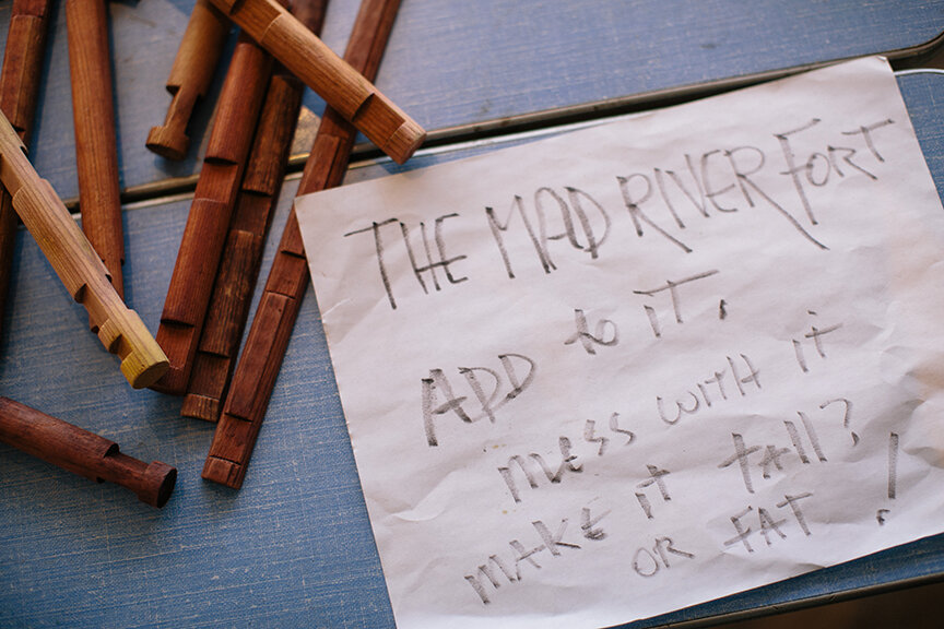
In April I spent two weeks in South Korea and a week in Japan. While there, I did what I always do while touristing — visited many museums. Some of them were forgettable, but many are worthy of a post, including these two that are thematically very different but, geographically, neighbors; they are both located in Suwon, about 20 miles south of Seoul. First up is the Toilet Museum (Haewoojae) also known as “Mr. Toilet House.”

theexhibitdesigner_MrToiletHouse-exterior1.jpg
theexhibitdesigner_MrToiletHouse-exhibits1

The story behind Mr. Toilet House: Suwon’s late mayor Sim Jae-Duck was given the nickname “Mr. Toilet” for his passionate leadership of the “Toilet Culture Movement” to improve public toilets. In 1996 he started the Beautiful Toilet Culture Campaign, and the city declared its intent to build the most beautiful public toilets in the world (motivated also in part by the then-upcoming 2002 FIFA World Cup which they were to host). Mr. Toilet took things a bit further than merely creating government departments and task forces, however, when he rebuilt his own house in the shape of a toilet and named it Haewoojae, which means “a room where you can relieve your worries.” It features a central toilet room as the “core of living,” with transparent glass walls that turn opaque with the flip of a light switch. The house was completed in 2007, and upon Sim’s death in 2009, it was willed to the city of Suwon. The city then converted it into a museum and culture park.

theexhibitdesigner_MrToiletHouse-exhibits2

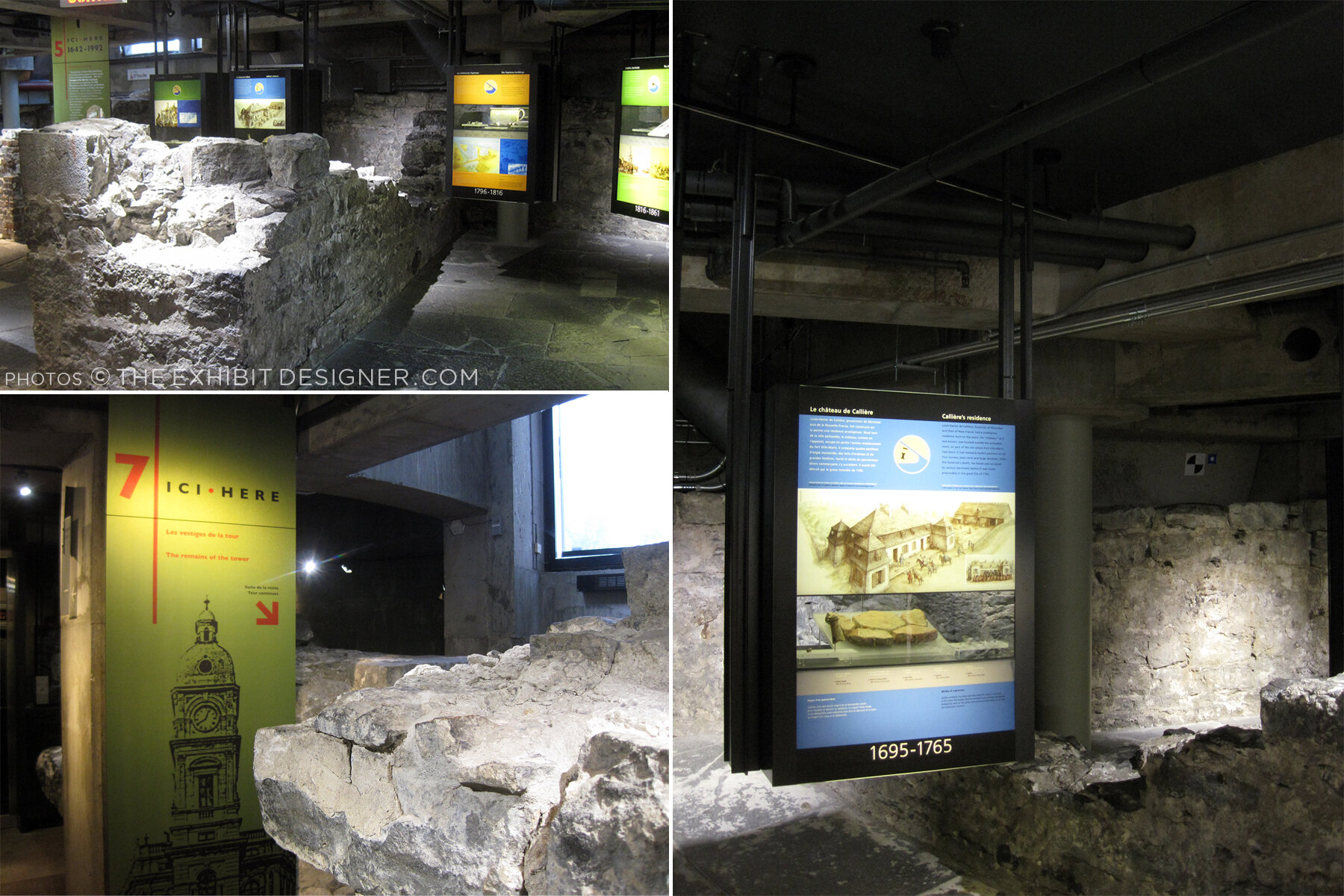
The museum is small and has clear, simple graphics (nearly all with English translations) that earnestly convey information about the history and global spread of modern sanitation, and other toilet-related subjects. There are also lighthearted illustrations of poops and flies (including on the floor, used as a navigational device) and hilarious double entendres in the writing.

Outside, there is a culture park. A meandering path leads you past examples of toilets, used throughout Eastern and Western history, that give an understanding of how toilets have physically changed over time.

theexhibitdesigner_MrToiletHouse-exterior2

Next door you can visit the Haewoojae Culture Center for a birds-eye view of the Toilet Museum.

theexhibitdesigner_MrToiletHouse-exterior3
theexhibitdesigner_NamJunePaikCenter-exterior2.jpg

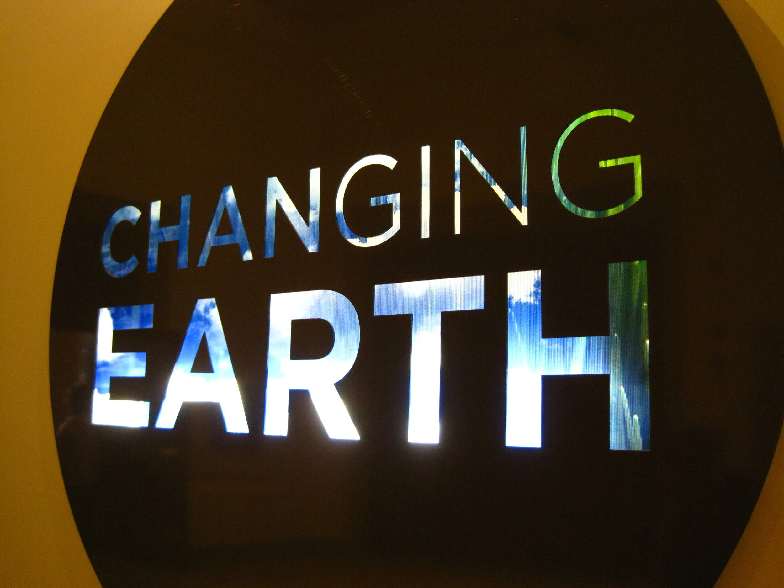
Our next stop in Suwon: the Nam June Paik Art Center. The Nam June Paik Art Center opened in 2008 and holds 248 pieces of video installations and drawings, mostly of Nam June Paik’s but also of other contemporary artists. The art center hosts changing exhibitions of Paik’s work, special exhibitions of contemporary artists, performances, events, and educational programs. It also houses Paik’s archives and a library, undertakes research, and publishes scholarly journals and monographs.

theexhibitdesigner_NamJunePaikCenter-exhibits1

The art center changes exhibitions regularly; they use their Nam June Paik-focused exhibitions to focus on different aspects of his work. While I was there, the exhibition was called Point-Line-Plane-TV, which “explored Nam June Paik’s canvas including intermedia [sic] such as television, score, film, and video, in notion of flatness.”

theexhibitdesigner_NamJunePaikCenter-exhibits2.jpg
theexhibitdesigner_NamJunePaikCenter-exhibits4

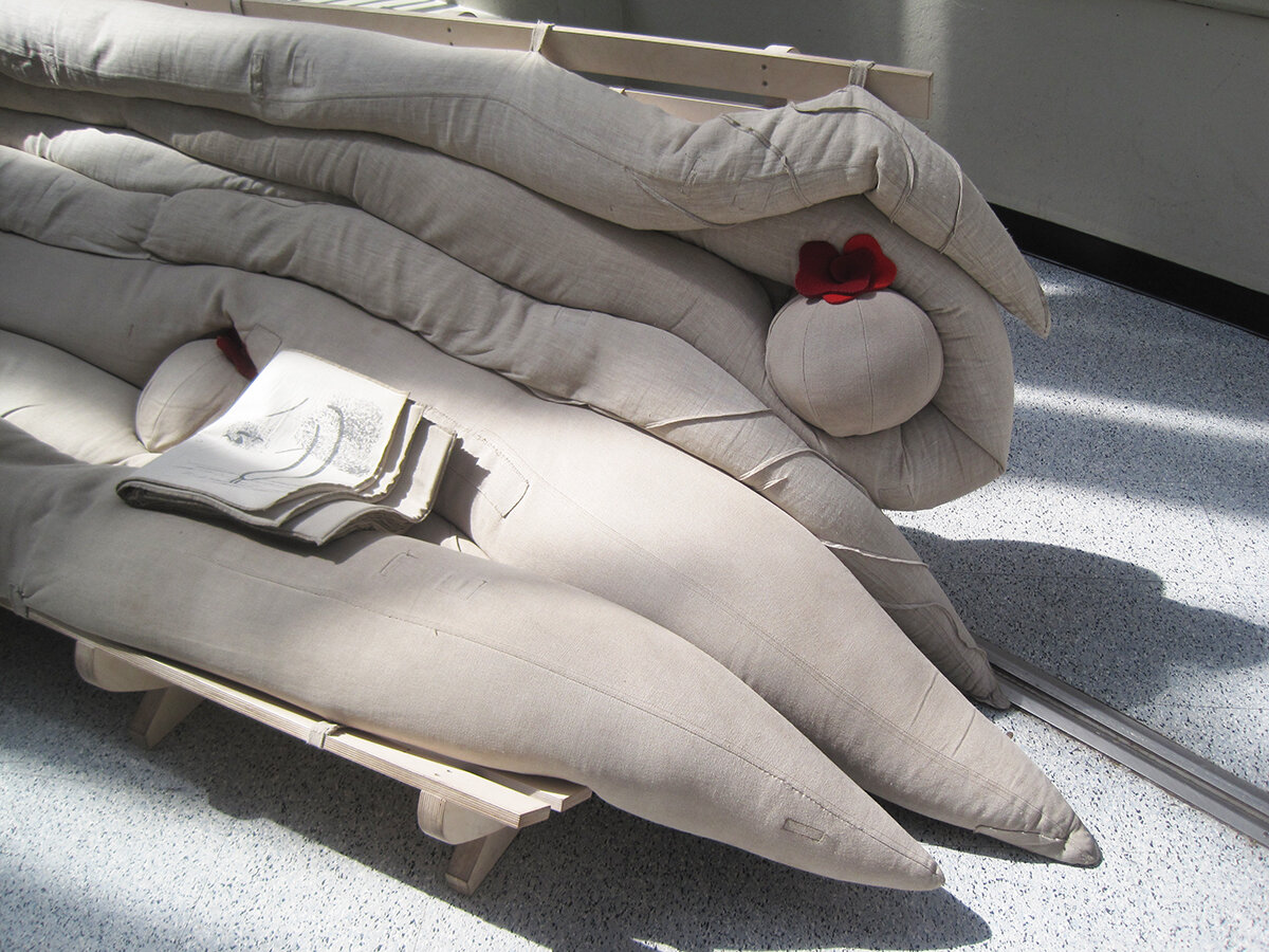
On the mezzanine level is the Education Room, seen in the photos below; a quiet place to have a seat and read some tables about the artist’s life.

theexhibitdesigner_NamJunePaikCenter-exhibits3

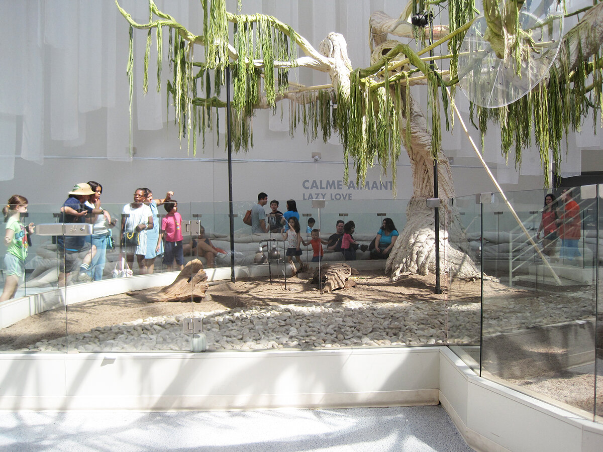
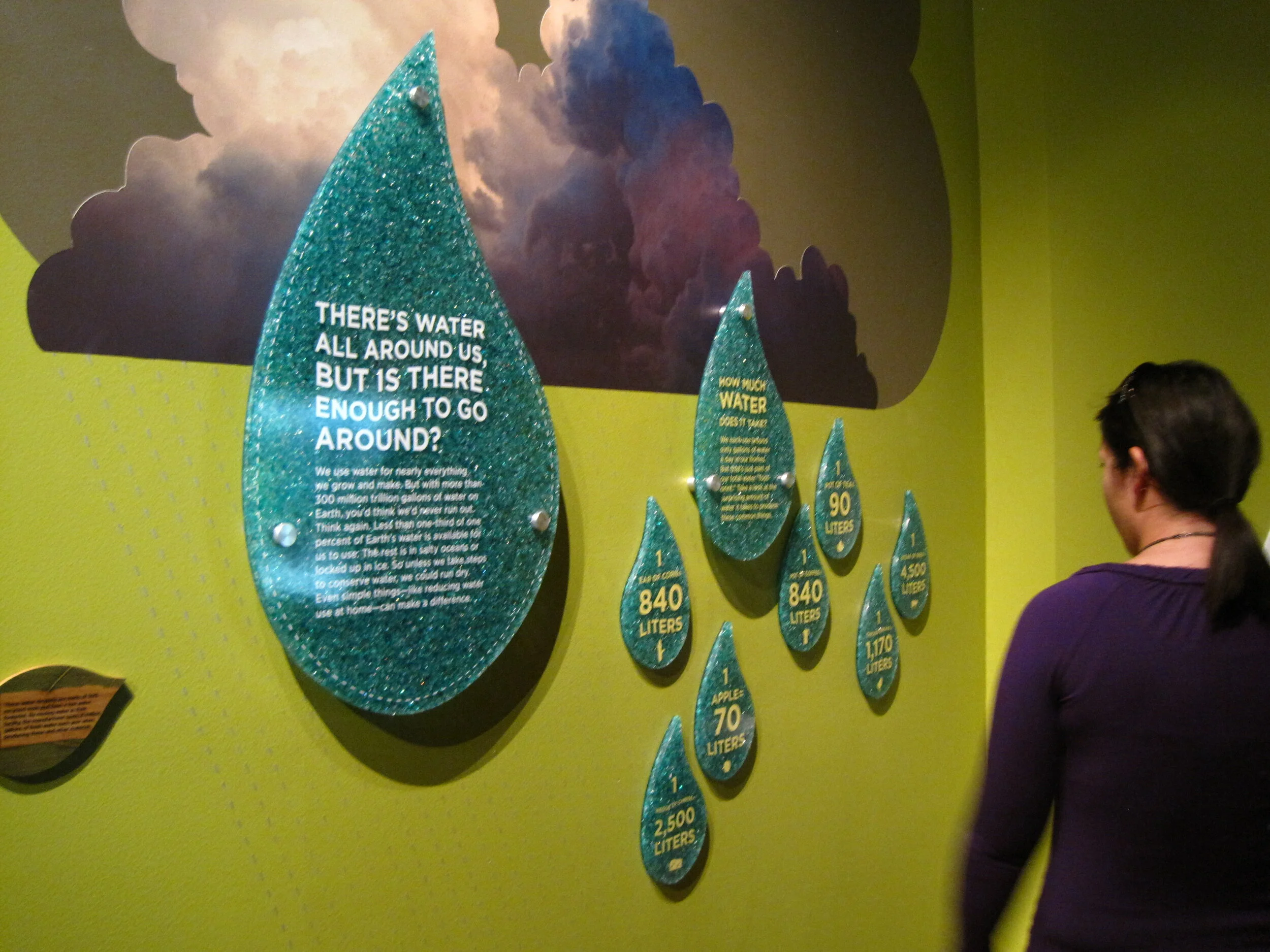
Upstairs was Imaginary Asia, a special exhibition of 23 pieces in the motion images genre. Many of the videos were projected onto large walls, with small bench nooks that could sit 2–3 people for viewing.

theexhibitdesigner_NamJunePaikCenter-exhibits6.jpg
theexhibitdesigner_NamJunePaikCenter-exhibits7

Like at Mr. Toilet House — and actually at many, many places I visited in South Korea — navigational cues and directions were applied directly to floors. In the Point-Line-Plane-TV exhibition as well they applied interpretive text to the floor. Interpretive text was in both Korean and English.

theexhibitdesigner_NamJunePaikCenter-exhibits5

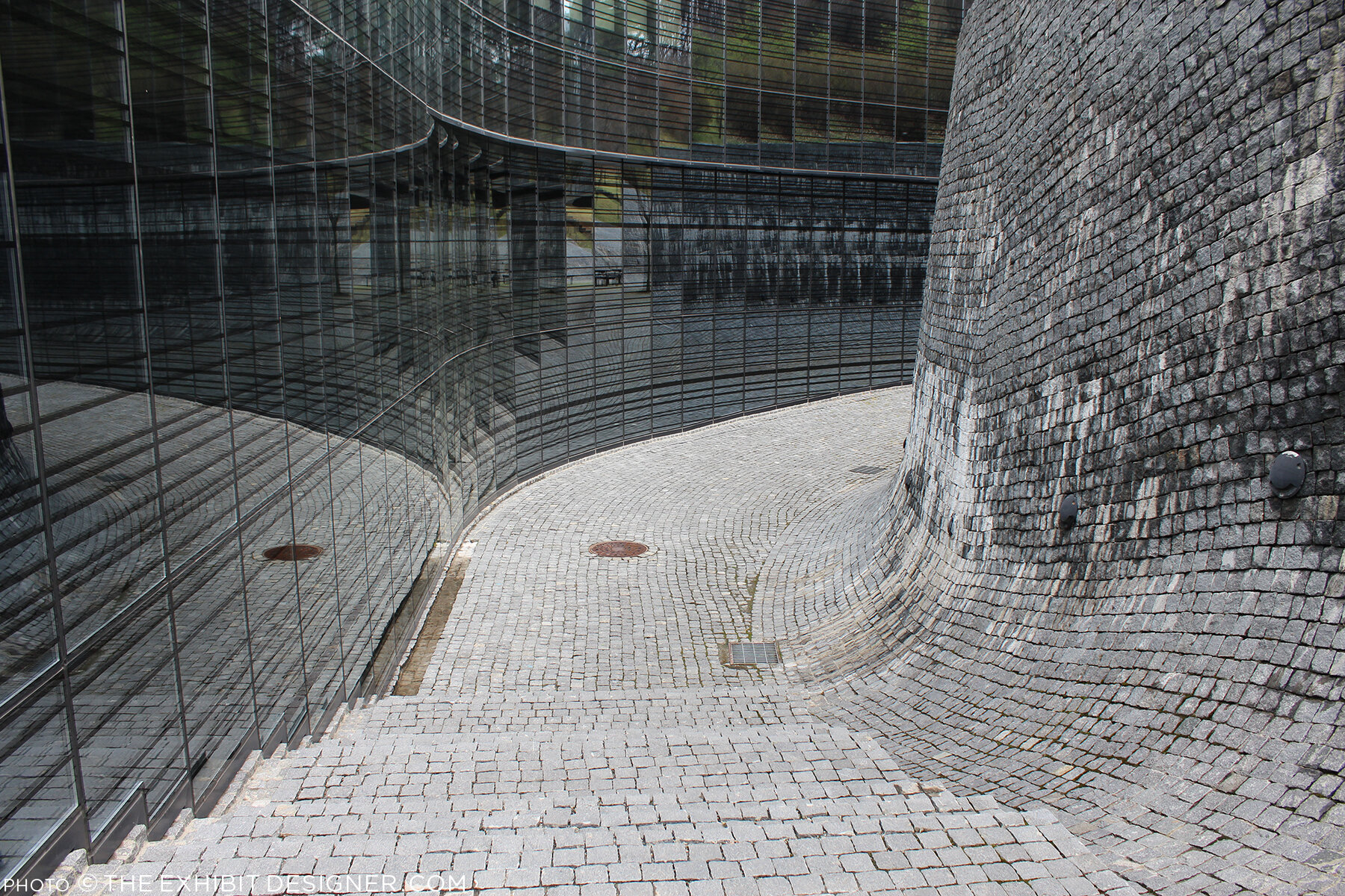
Outside, the curved glass exterior of the the art center is modeled on the form of a grand piano, a common motif in Paik’s work, and on the letter P. But that is only apparent when you look at the museum map — the actual experience from outside is simply of an impressive modernist building.

theexhibitdesigner_NamJunePaikCenter-exterior

There is a small park just beside the museum — perfect for a rest after an afternoon’s museum visit — and nearby are the Gyeonggi Provincial Museum (which has limited English translations) and the Gyeonggi Children’s Museum.

Post updated in January 2021 with minor text edits. Broken links have been replaced with archived URLs, courtesy of archive.org. This post was originally published at theexhibitdesigner.com on 24 May 2017.

Pointe-à-Callière: Crossroads, Building Montréal, Snow

My final post about the Montréal museums I saw during my visit to the city in September 2015 — see also the Insectarium, the Biodôme, and Lazy Love at the Biodôme — here’s a look back at Pointe-à-Callière, Montreal’s Archeology and History Complex.

theexhibitdesigner_Pointe-a-Calliere_lobby-banner.jpg

The Pointe-à-Callière complex is built on archeological sites that span the city’s history. Exploring the museum is very interesting, and a lot of fun — you take passageways, bridges, and stairs over and through the archeological remains. Like the museum building itself, which was built on pilings to protect the site, exhibition elements tread lightly among the artifacts, and visitors are asked repeatedly via signage not to touch the remains. Like most places in Montréal, museum graphics are in French with English translations. I like the way the two languages are interwoven on the red lobby banner above.

theexhibitdesigner_Pointe-a-Calliere_passageways

The permanent exhibition in the basement, Crossroads Montréal, takes you through 1,000 years of the city’s remains, including the first Catholic cemetery (dating from 1643), and the foundation of the Royal Insurance Building (dating from 1861). Excavations continue and more exhibitions are planned to interpret what is unearthed. On the one hand: very cool premise, and very cool space to explore. On the other, I had trouble getting and keeping my bearings. Perhaps because the graphics didn’t hold my attention? The ruins themselves were more intriguing.

theexhibitdesigner_Pointe-a-Calliere_graphics2

I would have liked more information directed at the museum “streakers” like myself: the people who move quickly through exhibitions, and only read titles and very selective [random] bits and pieces of labels. (On my best days, I can be a “stroller.”) Perhaps a printed guide map would have helped me to understand where I was within the museum and what I was looking at. Perhaps I should have taken a guided tour.

theexhibitdesigner_Pointe-a-Calliere_built-in-graphics

I did like the graphics’ integration into the museum’s building structure, particularly the ceilings, and the minimalist construction-site aesthetic of their structures. Artifact cases, too, were carefully integrated into the site.

theexhibitdesigner_Pointe-a-Calliere_built-in-cases
theexhibitdesigner_Pointe-a-Calliere_pipes
theexhibitdesigner_Pointe-a-Calliere_reader-rails

Most graphics were rear-illuminated, which worked perfectly with the museum’s underground atmosphere.

theexhibitdesigner_Pointe-a-Calliere_graphics3
theexhibitdesigner_Pointe-a-Calliere_graphics

Also below-ground is the Building Montréal exhibition, where you’ll find the museum’s archeological crypt. The photos below are of the vaulted stone tunnel built on the bed of the Saint-Pierre River. See what I mean about the museum being fun to explore?

theexhibitdesigner_Pointe-a-Calliere_passageway
theexhibitdesigner_Pointe-a-Calliere_archeological-crypt

Set into the floor of Building Montréal are more than a dozen dioramas that show the city at different points in time. I love this use of space, and the vantage point it gives visitors. (I wrote this post about exhibition flooring, seven years ago, and Bridget mentioned the Pointe-à-Callière in the comments. I finally saw it for myself!)

theexhibitdesigner_Pointe-a-Calliere_floor-dioramas
theexhibitdesigner_Pointe-a-Calliere_floor-models
theexhibitdesigner_Pointe-a-Calliere_building-montreal

At the time, the museum also had a temporary exhibit on view called Snow, a fun look at winter culture in Canada. Notice the snowflakes cut from the apron fronts of reader rails!

theexhibitdesigner_Pointe-a-Calliere_snow1
theexhibitdesigner_Pointe-a-Calliere_snow2
theexhibitdesigner_Pointe-a-Calliere_snow3

Post updated in January 2021 with minor text edits. This post was originally published at theexhibitdesigner.com on 25 March 2017.

Space for Life, part 2: Insectarium

Update: The Insectarium is being redesigned, and is scheduled to reopen in 2021.

The Insectarium was our second stop in Montréal’s natural museum complex, Espace Pour La Vie (“Space for Life”). It’s a fascinating and excellently-designed museum. Its exterior looks like a home for insects, almost like a bee hive:

theexhibitdesigner_insectarium-exterior

The permanent exhibition is called We Are the Insects and it is predominately ... very green. Graphics are a mix of strikingly clean layouts and comic book-inspired illustrations.

theexhibitdesigner_insectarium-we-are

Here’s the view down to the bulk of the exhibition:

theexhibitdesigner_insectarium-overview

Each of the glowing cubes is a display case. Specimens are pinned to a rear-lit graphic, around text and images arranged in a clean, gridular design. Each layout looked nicer than the last, so I'm going to share photos of many.

theexhibitdesigner_insectarium-case-graphics1

Some layouts have a sense of irreverence, like this one, with its marching ants:

theexhibitdesigner_insectarium-case-graphics-fun

The different accent colors and stylized illustrations indicated the habitats (e.g. tropical forests) for the specimens.

theexhibitdesigner_insectarium-case-graphics2
theexhibitdesigner_insectarium-terrarium

Throughout the exhibition there were terrariums with some live critters, and beneath some display cubes there were dioramas (faux terrariums, if you will).

theexhibitdesigner_insectarium-faux-terrarium
theexhibitdesigner_insectarium-butterflies

There were wall displays, and plenty of interesting charts and diagrams. There were sections about insect lifestyles, diets, reproduction, and what people can do to protect endangered insects. The sheer number of displays could have made for a repetitive slog, but it did not feel that way at all — specimens were fascinating, text was succinct, and the layouts were visually varied while staying true to the design system.

theexhibitdesigner_insectarium-timeline-charts
theexhibitdesigner_insectarium-reproduction-pros
theexhibitdesigner_insectarium-different-tastes
theexhibitdesigner_insectarium-protect

Outside were additional exhibitions and a temporary interactive art installation. And then we were off to explore the Botanical Garden.

theexhibitdesigner_insectarium-outside-exhibits

Post updated in January 2021 with minor text edits. Broken links have been replaced with archived URLs, courtesy of archive.org. This post was originally published at theexhibitdesigner.com on 15 March 2017.

Space for Life, part 1: Biodôme

Back in September 2015, I spent a handful of days in Montréal. I visited a few museums, but at the time, I only gave one temporary exhibition at the Biodôme brief mention on this blog. This happens all the time — I take photos everywhere I go, and then I just sit on them.… So let’s dust off those photos (or pretend it’s September 2015), and visit the Biodôme.

theexhibitdesigner_biodome-entrance

The Biodôme is part of a museum complex called Espace Pour La Vie (“Space for Life”) that also includes the Insectarium, Jardin botanique (botanical gardens), and Planétarium. You can buy combination admission tickets and pick which you would like to visit. The largest exhibition, and primary draw, within the Biodôme is Ecosystems of the Americas. (But don’t miss the Insectarium!) The Ecosystems exhibition is broken into four ecosystems conveyed by immersive landscaping, climate, and live vegetation and wildlife. For example — the air inside the Tropical Rainforest ecosystem is warm and muggy, while inside the Sub-Antarctic Islands ecosystem it is decidedly chilly.

theexhibitdesigner_biodome-tropical-rainforest.jpg

Inside the Tropical Rainforest you walk through mature and secondary forests, and pass a waterfall, lake, river, cliffs, and caves. Graphics throughout are minimal, restricted to brief labels and occasional monitors. Like most places in Montréal, text is in French, with English translations.

theexhibitdesigner_biodome-tropical-rainforest-graphics

Charming illustrations and species’ statuses are available in the free Identification Guide.

theexhibitdesigner_biodome-guide

Inside the cave you’ll find terrarium-dwellers and nocturnal-types; these graphics were all rear-illuminated, and included a bit more information than graphics in the Rainforest:

theexhibitdesigner_biodome-tropical-rainforest-night-exhibit

Moving along, you reach the Laurentian Maple Forest. At the entrance to each ecosystem you are greeted by a large wall mural: a collage of color-saturated photos, clean-lined vector illustrations, and a where-in-the-world diagram.

theexhibitdesigner_biodome-maple-forest
theexhibitdesigner_biodome-maple-forest-graphic

Maintaining the minimal aesthetic throughout, there are still elements of whimsy, such as photos of playful otters applied to the glass wall of their enclosure. Wayfinding elements also show up on the floor, and on support columns.

theexhibitdesigner_biodome-polar

Downstairs, there are a couple of small exhibitions: the Naturalia Room, which is directed toward children, and a temporary exhibition, which at the time was The Fossil Affair.

Overall, the Biodôme was a fun museum to visit, and the immersive ecosystems were well-done.

theexhibitdesigner_biodome_fossil-affair

Post updated in January 2021 with minor text edits. Broken links have been replaced with archived URLs, courtesy of archive.org. This post was originally published at theexhibitdesigner.com on 14 March 2017.

AIGA Design Week and Timber City at National Building Museum

DC Design Week events have wrapped. This was a good Design Week — there were many more events than in years past, with a range of design focuses — and I was able to make it to a number of them! An event of particular interest to exhibition designers was held on Wednesday, at the National Building Museum: Design Matters with Debbie Millman featuring Abbott Miller: Design for the Built Environment.

theexhibitdesigner_dc-design-week

The conversation touched on exhibition design, architectural graphics, and performance design. And as a bonus, prior to the event start, the museum's newest temporary exhibition, Timber City, was open for us.

theexhibitdesigner_timbercity4

Timber City opened in September and is on view at NBM through May 2017. The two huge title signs in the museum atrium draw your eye up and point to the bay where the exhibition is located. Also impressive in its scale is the scaffolding holding up the signage.

theexhibitdesigner_timbercity5

The exhibition is not restricted to the interior gallery space. Lining the hall outside the gallery are large plinths, of staggered heights, that feature stories about buildings' timber technology. Within the window bays are views into the exhibition, and architectural models in cases. The text on the painted green walls appears to be cut vinyl.

theexhibitdesigner_timbercity6
theexhibitdesigner_timbercity3

Inside the gallery space, the exhibition is made up of large-scale, extra-thick, freestanding wood walls. (You can see the support structures below.) Graphics appear to be a mix of direct-print and cut vinyl. The large murals at either end of the gallery space are applied wallpapers.

theexhibitdesigner_timbercity11
theexhibitdesigner_timbercity7
theexhibitdesigner_timbercity8

Note for future exhibits: Laminated Strand Lumber does not take cut vinyl letters well. (above)

theexhibitdesigner_timbercity2

In the center of the gallery space are a trio of cheeky display case plinths, made of stacked wood circles. The wood walls are peppered with infographics, stylized illustrations, and green circles highlighting quick facts about timber.

theexhibitdesigner_timbercity9
theexhibitdesigner_timbercity10

Timber City was curated and designed by Boston-based ikd. And thanks to AIGA DC for putting on a great week of design events!

theexhibitdesigner_timbercity1

Post updated in January 2021 with minor text edits. Broken links have been replaced with archived URLs, courtesy of archive.org. This post was originally published at theexhibitdesigner.com on 31 October 2016.

California Academy of Sciences, part 2: color and quakes

If forced to choose, my favorite part of the California Academy of Sciences would be the Rainforest Dome — check out Part 1 of my visit — but there were many other fascinating exhibitions to enjoy, including Color of Life: Discover Nature's Secret Language, designed by the museum’s Exhibits Studio and opened last year.

theexhibitdesigner-SF-academy-sciences_color-of-life
theexhibitdesigner-SF-academy-sciences_color-of-life4

The exhibition uses bright, bold colors, beautiful photographs, and accessible writing to “reveal the significant roles color plays across a spectrum of species.”

theexhibitdesigner-SF-academy-sciences_color-of-life2
theexhibitdesigner-SF-academy-sciences_color-of-life3
theexhibitdesigner-SF-academy-sciences_color-of-life5

Within the 8,000 square foot exhibition are immersive interactive experiences, including a musical color visualizer, designed by Tellart. Video screens respond to strings, plucked by visitors, with a show of images and videos related to that string’s color.

theexhibitdesigner-SF-academy-sciences_color-of-life7

Another popular interactive experience is the “Courtship Dance Stage.”

theexhibitdesigner-SF-academy-sciences_color-of-life8

Throughout the exhibition are dioramas and small interactives that allow you to see organisms under different types of lighting, or through the eyes of other animals (just for example).

theexhibitdesigner-SF-academy-sciences_color-of-life6.jpg
theexhibitdesigner-SF-academy-sciences_color-of-life9
theexhibitdesigner-SF-academy-sciences_earthquakes

Also 8,000 square feet in size, the older (circa-2012) exhibition, Earthquake: Life of a Dynamic Planet, explores the seismic science of Earth’s geologic transformations through installations such as a 25-foot-wide, walk-through model of Earth, and the immersive “Shake House.”

theexhibitdesigner-SF-academy-sciences_earthquakes2

Other sections of the Earthquake exhibit focus on the diverse life forms that evolved and spread as Pangaea split up, and earthquake preparedness.

theexhibitdesigner-SF-academy-sciences_life-drifts

There are mini-exhibits throughout the museum, including a show of Andy Warhol’s Endangered Species series of silkscreen prints, from 1983. In 2007 the bald eagle was removed from the endangered species list; the other featured animals remain.

theexhibitdesigner-SF-academy-sciences_hall3

Other mini-exhibits focused on variation, in ladybugs and in humans. 

Rounding out my visit, I strolled through the Human Odyssey exhibition, an exploration of the origins of humankind, and the African Hall, home to classic, stuffy, stuffed-animal dioramas (and live penguins).

theexhibitdesigner-SF-academy-sciences_african-hall.jpg

I highly recommend this museum — it’s beautifully designed, fascinating, and educational. I also recommend you consider picking up a City Pass if you plan to visit more than one museum. They are expensive in San Francisco — said from DC, where the museums are mostly free.

Post updated in January 2021 with minor text edits. Broken links have been fixed. This post was originally published at theexhibitdesigner.com on 3 October 2016.

California Academy of Sciences, part 1: rainforests and reefs

I wrapped up June — oh, wow it’s August! — with a trip to Yosemite (happy birthday, National Park Service) and San Francisco, where I spent a day parade-watching and a couple days museum-going.

theexhibitdesigner-SF-pride-2016

One museum that filled nearly an entire day was the California Academy of Sciences in Golden Gate Park. Below is a photo of the museum’s exterior and its brilliant Living Roof, as seen from the de Young Museum.

theexhibitdesigner-SF-academy-sciences_living-roof

There are so many exhibits within “the Academy” (and so many photos to show) that I’ve broken this post into two parts. Part 1 here covers the Aquarium on the lower level, designed by Thinc Design, and the Rainforest on Level 1.

theexhibitdesigner-SF-academy-sciences_visitor-guide

After entering the museum I was swept up with the crowds heading to the 4-story, 90-foot-diameter Rainforest Dome. Inside, the rainforest visit begins on a Bornean forest floor, winds upward through a Madagascan mid-story and a Costa Rican canopy, then ends on the lower level in an Amazonian flooded forest.

theexhibitdesigner-SF-academy-sciences_rainforest-dome

As a designer, I liked the dome’s juxtaposition of glass and steel and abstracted jungle motifs against living flora and fauna, and the changing vistas as I moved further up the dome. As a nature enthusiast, I enjoyed its subject matter; as a weary museum visitor, I appreciated its delivery: not too much, not too little; brief, interesting, and useful.

theexhibitdesigner-SF-academy-sciences_rainforest-levels
theexhibitdesigner-SF-academy-sciences_rainforest-area-signs
theexhibitdesigner-SF-academy-sciences_rainforest-animal-signs

The bright, straightforward graphics make use of vivid photographs, and the occasional illustration of an animal signals your arrival in a new area of the jungle. Bamboo- or vine-like vertical posts give a stylized–naturalistic element to exhibit tanks. The light touch with exhibit elements gives the rainforest dome a feeling of exploration and discovery (just ignore the school groups).

At the top of the dome, look out over the three stories you’ve just visited, and down, through a 100,000 gallon tank, to the flooded forest floor. Take an elevator down, then enter the tunnel you were just looking through from afar. Everyone says “oooh.”

theexhibitdesigner-SF-academy-sciences_rainforest-dome-lower2
theexhibitdesigner-SF-academy-sciences_rainforest-dome-lower1.jpg

The aquarium level felt jam-packed and massive; it’s where I spent most of my time during a 3 hour + visit. There were many exhibitions to see: Amazon Flooded Forest, Water Planet, California Coast, Coral Reefs of the World, Twilight Zone, and more.

Down here, animal identification is found on digital touchscreens. They were intuitive and fun to use, and had just the right amount of information: an animal’s common name, its scientific name, diet, and a one-sentence fact about it.

theexhibitdesigner-SF-academy-sciences_rainforest-digital-signs

Below are some photos of the Water Planet exhibition, which groups underwater animals by adaptations. Projected blue and green lighting casts an underwater glow on the sculptural wave walls (similar material here). In the center of the room are curvilinear tanks. (I was reminded of the Van Cleef & Arpels traveling exhibition, circa 2012. It must be the bubbles.)

theexhibitdesigner-SF-academy-sciences_aquarium-water-planet.jpg
theexhibitdesigner-SF-academy-sciences_aquarium-water-planet2
theexhibitdesigner-SF-academy-sciences_aquarium-water-planet3
theexhibitdesigner-SF-academy-sciences_aquarium-cal-coast

The highlight of the Coral Reefs of the World exhibition is the 25-foot deep Philippine Coral Reef tank (above). The exhibit graphics in this area are large image-based wallpapers.

theexhibitdesigner-SF-academy-sciences_aquarium-cal-coast2
theexhibitdesigner-SF-academy-sciences_aquarium-cal-coast3

The exhibition Twilight Zone: Deep Reefs Revealed had just opened on June 10. It’s memorable for its tanks filled with the most incredible jellies and vivid deep sea fishes.

theexhibitdesigner-SF-academy-sciences_aquarium-twilight-zone

Post updated in January 2021 with minor text edits. Broken links have been fixed. This post was originally published at theexhibitdesigner.com on 23 August 2016.

Weekend in NYC: the Cooper Hewitt, Jewish Museum, more

I went up to New York City a couple weekends ago. My time was packed with museum visits, including my first to the Tenement Museum, at 97 Orchard Street in Manhattan’s Lower East Side. I took their Shop Life tour. The museum’s sixty- and ninety-minute-long tours are docent-led through restored tenement apartments. Most tours focuses on one apartment, one period in time, and one actual family; the Shop Life tour is slightly different in that it highlights multiple families, across time periods, who lived and worked in the basement-level shops. I highly recommend the museum for an engrossing, educational experience. (Summertime hint: the Shop Life tour is the only one air-conditioned!)

From top left, clock-wise: volunteers pull weeds on the High Line; the entrance to the "Shop Life" tour at the Tenement Museum (no photos allowed inside!); Fly By Night at the Brooklyn Navy Yard; Goshka Macuga at the New Museum

From top left, clock-wise: volunteers pull weeds on the High Line; the entrance to the "Shop Life" tour at the Tenement Museum (no photos allowed inside!); Fly By Night at the Brooklyn Navy Yard; Goshka Macuga at the New Museum

I also stopped by the New Museum, since I was in the neighborhood for the Tenement Museum, and truth be told, I was mostly perplexed (I’m not that hip, apparently). I paid another visit to the High Line, which has expanded and its plantings matured since I was last there. And I saw a performance of Duke Riley’s Fly By Night, in which, “at dusk, a massive flock of pigeons … elegantly twirl, swoop, and glide above the East River.” The pigeons wear LED anklets and respond to whistles and waving flags, flying overhead as commanded. The performance pays homage to the mostly forgotten culture of pigeon keeping and — with just another week to go — is being held at the Brooklyn Navy Yard, once home to the country’s largest naval fleet of pigeon carriers. I loved it.

theexhibitdesigner_new-york-met-breuer

At the Met Breuer, the Metropolitan Museum of Art’s new home for modern and contemporary exhibitions (in the Whitney’s former building), I saw the exhibition Unfinished. There was nothing ground breaking in the actual exhibition design, but the premise was compelling and a lot of the artwork was fantastic.

And I took in the Nasreen Mohamedi retrospective. (Just closed, on June 5.) After the jam-packed Unfinished, the meditative exhibition was a welcome respite.

theexhibitdesigner_new-york-met-breuer2

But hands down, my two favorite exhibits during this visit were at the Jewish Museum and the Cooper Hewitt.

theexhibitdesigner_new-york-jewishmus_burle-marx

At the Jewish Museum, I fell in love with Roberto Burle Marx. Burle Marx was a Brazilian artist who drew upon diverse cultural influences to reinvent the landscape architecture discipline. He incorporated abstracted, irregular forms, native plants (he was a passionate environmental advocate), and Brazilian modernism into his landscape designs. His work is incredible; visit this exhibition!

theexhibitdesigner_new-york-jewishmus_burle-marx-exhibit-cases

The exhibition design was spot-on, evoking the geometries and curves of Burle Marx’s landscapes and emphasizing the art on display. An interlocked massing of display cases in the center of the room dominated the exhibition space; an 87-foot-long tapestry (below, left), designed by Burle Marx for the Santo André Civic Center in 1969, provided a stunning focal point. His hand-drawn and painted landscape plans are wonderful to behold; some examples from the exhibition are shown below.

theexhibitdesigner_new-york-jewishmus_burle-marx-exhibit-displays
theexhibitdesigner_new-york-jewishmus_burle-marx2

A few blocks north, Beauty, the Cooper Hewitt Design Triennial was bustling. The wide-ranging contemporary design exhibition is a must-see for designers and artists.

theexhibitdesigner_new-york-cooper-hewitt-beauty
theexhibitdesigner_new-york-cooper-hewitt-beauty2

The exhibition design was minimal, just the simplest of reader rails and small text panels. The museum encourages use of “pens” that allow you to interact with the digitized collection on touchscreen tables and to save objects from the exhibitions to be accessed later. A nice benefit of accessing your visit online is that for each object, museum curators have selected related objects for further exploration. For example, the online entry for Atmospheric Reentry, designed by Maiko Takeda (above, left), led me to this hat from Cameroon and this “hairy” garden pavilion.

theexhibitdesigner_new-york-cooper-hewitt-beauty-reader-rails

Below is one of my favorite entries from the Beauty Triennial, Architecture is Everywhere, designed by Sou Fujimoto Architects. From the project description: “the project discovers architectural possibility in found objects and everyday materials. Simple artifacts such as a lottery ticket, an ashtray, or a ring of binder clips become intriguing structures when placed on pedestals with tiny human figures.” It was delightful.

theexhibitdesigner_new-york-cooper-hewitt-beauty3

Post updated in January 2021 with minor text edits. Broken links have been fixed. This post was originally published at theexhibitdesigner.com on 13 June 2016.

SEGD tour of National Museum of Health and Medicine

On Sunday I attended a tour of the very cool National Museum of Health and Medicine, now located in Silver Spring, Maryland. NMNH is a Department of Defense museum first established in 1862 as the Army Medical Museum, “a center for the collection of specimens for research in military medicine and surgery.”

the-exhibit-designer_SEGD-NMHM-tour1

The tour was organized by the Washington, DC chapter of SEGD (formerly the Society for Environmental Graphic Design, now the Society for Experiential Graphic Design) and led by members of the museum’s staff and the design team from Gallagher & Associates. (I used to be a designer at G&A.)

the-exhibit-designer_SEGD-NMHM-tour3

There was a crowd in attendance so we were split into two groups. My group was led by graphic designer Liza Rao (responsible for the museum’s fantastic colors and typography), and Andrea Schierkolk, NMHM’s public programs manager. It was a treat to hear reflections from both sides; what they love and what they love less; things that work great and things that didn't turn out as expected. It was also a treat to see some of my former colleagues.

the-exhibit-designer_SEGD-NMHM-tour4
the-exhibit-designer_SEGD-NMHM-tour5

The museum is divided into three major exhibits: Collection That Teaches (purple), Anatomy and Pathology (turquoise), and Advances in Military Medicine (brick red). Crisp white casework and glass shelves give the exhibit a “lab-like” look that I enjoyed, and the bold shots of color look great against the mostly tan, cream, and yellow objects on display — yes, most of those objects are corporeal remains. This museum is not for the sensitive of stomach.

the-exhibit-designer_SEGD-NMHM-tour2
the-exhibit-designer_SEGD-NMHM-tour7

The exhibits were designed precisely for the current objects on display, yet they are still changeable — graphics can be slid in and out as objects are rotated or stories are updated.

the-exhibit-designer_SEGD-NMHM-tour8

Thank you to our new DC SEGD chairs, Liza and Chris, for the great program — keep them coming, please!

the-exhibit-designer_SEGD-NMHM-tour6

Post updated in January 2021 with minor text edits. This post was originally published at theexhibitdesigner.com on 16 March 2016.

Lazy Love at the Biodôme

I was in Montréal for just shy a week and spent a few hours at the Biodôme — it was so much fun! I have plenty to share of the rest of the museum, but to dip my toes back into blogging after (ahem) plenty of time away, here are some photos of the temporary exhibit/art installation, Calme Aimant (Lazy Love).

Within the low, glass-walled enclosure, sloths slept inside their cocoon-like nests, hanging from artistic interpretations of trees — the trees were wrapped in braids and painted in monochrome — while a couple tortoises tottered around. Sheer white fabric panels hung from the ceiling, rippling slightly as people passed beneath them.

The exhibit invited guests to have a seat and enjoy a few moments of quiet contemplation. A quiet soundscape played from speakers hidden within the sofas — the speakers are the balls with red felt flowers — and fabric books told the sloths’ story.

Lazy Love was our last stop at the Biodôme, and it was a lovely, relaxing, quiet moment to end on. I am sorry to report that the exhibit closed last week, so a bientôt, sloths.

Post updated in January 2021 with minor text edits. Broken links have been replaced with archived URLs, courtesy of archive.org. This post was originally published at theexhibitdesigner.com on 18 September 2015.

Madsonian Museum of Industrial Design

Back in November I took a trip to Warren, Vermont for a shoot with photographer Michael Tallman at the Archie Bunker House. When you hear “Vermont” and “architecture” your thoughts might not wander much beyond old red barns, but look up Prickly Mountain — the “anti-establishment utopia” of contemporary architecture. The Archie Bunker House is in that neighborhood of modernist homes, and really incredible. The shoot was a blast, and I promised David Sellers, the owner and architect of the house, that I would visit the Madsonian, his industrial design museum up the road.

I ran out of time during that trip in November, but a few weeks ago I made good on the promise, returned to Vermont and paid a visit to the Madsonian Museum of Industrial Design in Waitsfield. The temperature outside was somewhere between 0 and 5 degrees, and inside, the museum wasn’t much warmer, but still my friends and I had a great time touring the museum with Mr. Sellers himself as our tour guide.

The museum has an Industrial Designers “wall of fame,” an assortment of chair designs, vintage advertisements torn straight from magazines and pinned to the walls …

… lighting, a Mason and Hamlin organ, and a 1934 DeSoto Airflow coupe …

… an automatic pencil sharpener, Polaroid cameras, and many, many more examples of vintage and antique industrial design. Most everything on display had a personal story attached, such as this menu from the ocean liner SS Normandie. A couple donated it to the museum after their visit — they had honeymooned on the ship in the 1930s and kept the menu as a souvenir.

The layout of the exhibit was strictly utilitarian, with minimal to no explanatory text or graphics and the bones of the building which housed it on display. One bit of clever exhibitry I liked was the use of retractable extension cord reels for spot lighting. Need to move something around? Just screw in a new hook.

The Madsonian currently has an exhibit of classic toy designs, featuring model airplanes and trains (including the two biggest model trains built), an original Mr. Machine, and a toy cement mixer which a kid could use to mix actual cement. The toy’s fatal flaw was user error — most surviving examples are welded inoperable by dried cement.

If you go, be sure to grab a sandwich and a Sip of Sunshine afterward, at the Bridge Street Butchery (now closed) across the street.

Thank you to Michael Tallman for all photographs and to Dave Sellers for the museum tour!

Post updated in January 2021 with minor text edits. Broken links have been fixed. This post was originally published at theexhibitdesigner.com on 1 March 2015.

My hazy memories of the Perot Museum

A few days ago I was talking with some colleagues about the Perot Museum of Nature and History in Dallas, Texas. Someone remembered one responsive interactive; I remembered a different one ... and then I remembered that I haven’t shared any photos from my visit (nearly a year ago).

The responsive interactive I remembered was located in the lobby. Models of water molecules danced up and down from the ceiling in response to the movements of people below. The molecule models were controlled by cameras in the ceiling that sensed movement and triggered motors that made them dance.

And that’s about where my specific memories break down. What I do remember is how large the museum is, with 11 permanent exhibit halls, and that the day I went it was JAM-PACKED.

There was something there for everyone though, even if it took a bit of maneuvering to get around and find it. I liked the dinosaur gallery:

And bits and pieces of other galleries, including the entrance to the Gems and Minerals Hall:

I was really taken with these benches sprinkled throughout the museum, with their cut-out factoids:

Overall, we were intrigued, learned some things, and had fun. (Just don’t ask me for details.)

I’ll wrap this post up with a photo I took of the roof. From the museum’s Wikipedia page: “It has a stone roof which features a landscape of drought-tolerant greenery inspired by Dallas surroundings. … Building on the museum’s commitment to resource conservation, the new building integrates a variety of sustainable strategies including a rainwater collection system that captures run-off water from the roof and parking lot, satisfying 74% of the museum’s non-potable water needs and 100% of its irrigation needs.”

Post updated in January 2021 with minor text edits. This post was originally published at theexhibitdesigner.com on 20 March 2014.

Game on: The Art of Video Games

I visited The Art of Video Games at the Smithsonian American Art Museum. (It’s gotten quite a bit of press — here is one thoughtful review, from The Mary Sue.) The exhibit covers the past 40 years of video game art and includes interviews of game designers and developers, conceptual art, video displays of 80 games (voted on by the public), and playable games (five, for the five eras of game technology).

I would have loved to play some Super Mario Brothers, but the wait was at least 10 kids deep so I had to move on. Vintage game consoles were on display in lit display “consoles,” along with video game stills and interpretive text.

The exhibit designers describe their process and the materials and production techniques used, in this blog post from Smithsonian Exhibits. There is also an upcoming gallery talk, “Building The Art of Video Games(link no longer available) on August 21. For those of you not in the DC area, the exhibit will travel beginning late October.

Post updated in January 2021 with text edits. Broken links have been replaced with archived URLs, courtesy of archive.org. This post was originally published at theexhibitdesigner.com on 15 August 2012.

Another world: the Van Cleef & Arpels traveling exhibit

I am awed by the Van Cleef & Arpels traveling exhibition. But alas, I can only look at photos.

My colleague Zhengyuan saw this exhibit twice. Once while it was on view in NY at the Smithsonian Cooper-Hewitt (where it was called Set in Style) and then again when it moved to MOCA Shanghai (where its name was changed to Timeless Beauty). (When it was on view in Tokyo it had yet another name, Spirit of Beauty.)

Zhengyuan shared photos of the MOCA Shanghai exhibit:

She described the exhibit, “they didn't move the entire exhibit set to Shanghai, but there were some new displays, like the octopus-like structure. The space is very dark ... and the sparkling bubble glass displays make it look like an underwater world!” She thought both versions were fantastic.

The designers, Patrick Jouin, explain: “for this exhibition we wanted the visitors to lose all sense of time, to open a door onto an imaginary world. The nature theme, which is a major source of inspiration for Van Cleef & Arpels, has also influenced the scenography. The pieces in the exhibition are presented in gigantic glass drops. In order to create a sensual and mysterious installation, we have used various types of illusions.”

The photos below are from the Cooper-Hewitt exhibit, taken by Matt Flynn, © Smithsonian Institution:

While both exhibit versions used the bubble glass cases, the Cooper-Hewitt’s version seemed more traditional than MOCA Shanghai’s. Less octopus-structure and more tables and wall vitrines. I’m curious what challenges the designers had to address as they designed an exhibit for travel to four different countries (Japan, the US, Shanghai, and France). In all its iterations, it is a gorgeous exhibition.

Post updated in January 2021 with minor text edits. Broken links have been fixed. This post was originally published at theexhibitdesigner.com on 21 June 2012.

America’s Mayor, at MCNY

Dragging out photos from the archives for your inspiration:

I loved this exhibit at the Museum of the City of New York. America’s Mayor: John V. Lindsay and the Reinvention of News York opened and closed two years ago, but I still remember it for its bold colors and interesting story.

The museum’s description: “America’s Mayor examines the controversial tenure (1966–1973) and dramatic times of New York’s 103rd mayor. The exhibition presents John V. Lindsay’s efforts to lead a city that was undergoing radical changes and that was at the center of the upheavals of the 1960s and 1970s; it highlights Mayor Lindsay’s ambitious initiatives to redefine New York City’s government, economy, culture, and urban design. Through his outspoken championship of city life, commitment to civil rights, and opposition to the Vietnam War, Lindsay emerged as a national figure in a troubled and exhilarating era.”

The bold design pulled me in. I loved the punchy colors used on the murals and inside artifact cases. The images, text treatment, and the clustering of framed print artifacts, all helped to convey the upheaval of the time period.

Artifact vitrines intersect walls in interesting ways — such as the tabletop case above, and the vitrine below, which cuts into the triangular, freestanding wall. I liked the reflective, silver sides of the cases.

Also noteworthy was the amount of information and artifacts on display. Overwhelming, perhaps, for some, but my observation was that the people there were genuinely interested in reading and looking at objects and documents, and for those with shorter attention spans, the large titles provided sign posts to help locate areas that would be of most interest to them.

Post updated in January 2021 with text edits. Broken links have been replaced with archived URLs, courtesy of archive.org. This post was originally published at theexhibitdesigner.com on 10 June 2012.

Changing Earth, at the Franklin Institute

Changing Earth at the Franklin Institute in Philadelphia is about land, air, and water, and how these have changed and continue to change on our planet. There’s a lot happening in this exhibit and it was sometimes overstimulating, but overall it was nicely designed with clear ”take-home” messages and memorable interactive experiences.

The designers, Adirondack Studios, used environmentally-sensitive materials throughout the exhibit. From the museum’s website: “Changing Earth is constructed of sustainable materials. The flooring is made from recycled content and post-consumer waste products. All wood is Forest Stewardship Council certified or bamboo. All metal is recyclable. Paint is low-VOC and graphics are printed on recycled material using water-based inks.”

I visited this exhibit about a year ago, not too long after it opened (and wrote this post about the exhibit, Electricity, which had opened at the same time). My memories of the details are a little fuzzy I’m afraid, but both exhibits are still on view if you’d like to see them in person.

The centerpiece of the exhibit was a giant Earth dome (photo above) which housed an introductory film.

The exhibit was full of interactives and touchable displays, such as a stream table, weather forecast station, and earthquake simulator.

IMG_0151.jpg

Below is an example of the direct-to-substrate printing used throughout the exhibit.

IMG_0164.jpg
IMG_0157.JPG

Post updated in January 2021 with text and photo edits. This post was originally published at theexhibitdesigner.com on 4 April 2012.

Music at the MoMA

At the Museum of Modern Art in NY through June 6 is the exhibition Looking at Music 3.0. (Many installation photos at that link.) It explores music’s influence on contemporary art, and vice versa, during the 80s and 90s. Dim lighting, gaudy neon walls, and early music videos blasting on the large screen in the middle of the gallery — it’s as though you’ve returned to the time of boom boxes and mix tapes. Social and political issues are mentioned briefly in the exhibit copy, but there are many topics touched upon in this relatively small space, so don’t expect a thorough history lesson. Art and music are loosely grouped by topics such as “early hip hop” but, fittingly, neither chronology nor subject dictate the layout of the exhibition in an obvious way.

There was a large cushioned platform to sit and watch music videos. There were only a few in the loop, to discourage lingering I’d imagine. What they may not have realized is that people would stay quite awhile to watch Grace Jones. There were listening stations throughout the exhibition (below, left) and an interactive media installation by Perry Holberman (right).

You can read more about the process of creating the exhibit in this blog post, Listening to Art, written by the curator.

Below are photos of the entrance to Picasso: Guitars 1912–1914, an exhibition of 70 collages, constructions, drawings, mixed-media paintings, and photographs. On view through June 6 and definitely worth seeing.

Post updated in January 2021 with minor text edits. Broken links have been fixed. This post was originally published at theexhibitdesigner.com on 20 March 2011.

Electricity, at the Franklin Institute

Electricity at The Franklin Institute is about “the wonders of electricity … this interactive exhibit dedicated to the Museum’s namesake, Benjamin Franklin” serves up historical artifacts, cute diagrams ...

IMG_0217.JPG

… and plenty of techy interactives. The exhibit promises, “Learn how electricity is created and explore the fuel sources needed to generate our electricity. You’ll feel the force of electricity by manipulating electrical phenomena, exploring authentic artifacts … and tackling questions of sustainable energy.” Below, a touch screen to explore Ben Franklin's book Experiments and Observations on Electricity:

The “Electrical Signals” wall: use your phone and it responds with flashing LEDs. It was a lot of fun.

There were group interactives and experiments, and a “sustainable dance floor” which was a blast for all. The exhibit is ongoing.

Post updated in January 2021 with minor text edits. Broken links have been fixed. This post was originally published at theexhibitdesigner.com on 16 January 2011.

Build Boston 2011: Touring the MFA

GUEST POST

Writing and photography by Katelyn Mayfield, an exhibit designer at Christopher Chadbourne & Associates. She has a Bachelor of Architecture degree from the Rhode Island School of Design. In her spare time, she makes handstitched books.

After a private tour of the Museum of Fine Art Boston’s new Art of the Americas wing, given by architect Adi Toledano of CBT Architects, I now feel certain that Boston has a world class museum. The tour was given prior to the wing’s grand opening as part of Build Boston. We got up close and personal with the details since almost no one was around, except security guards and last minute glass case cleaners.

My first response in the galleries was to the artifact display cases. These cases were undeniably eye-catching, like no other. The glass was crystal clear, completely devoid of prints of any kind. When standing on one side of a case, I could see perfectly through it and into cases beyond because of the impeccable clarity. The sleekness of the cases also succeeds in hiding complex mechanics, as described in this article. All 200 cases in the new wing were designed, manufactured, and assembled in Milan, Italy by Goppion Museum Workshop before they were shipped to Boston for installation. Goppion has also created display systems for the Mona Lisa at the Louvre and the Crown Jewels of England, among others, so high quality craftsmanship is a given. And once I got past the perfection of the cases, the artifacts inside were not so bad themselves!

Sir Norman Foster along with Foster + Partners was the Design Architect and creative masterminds of the new wing. Our guide, Adi, kept repeating, “Foster wanted ‘everything to line up’”, meaning everything had to be flush. Foster gets what Foster wants. He was knighted in 1990 and won the Pritzker Architecture Prize for his entire portfolio in 1999, the most prestigious international prize awarded in the field of architecture. He was also awarded the American Institute of Architects Gold Medal in 1994. I think he is worthy of dictating every detail, as he did in this project. No detail was overlooked and all components work harmoniously. It was the responsibility of CBT, the local architect of record, to design the actual details that accomplished this harmony. For me, highlights were the “landscape corridor,” the day-lighting strategies, and the details that made “everything line up.”

The landscape corridor is a thoughtful nod to the existing museum structure and the outdoors. Between the original building and the new building, a narrow 6' space is left full of vegetation. While in the main courtyard, which has two elevations of three-story-high glass walls, the corridors are visible on either side. The natural light, the view of the vegetation and the sky beyond, and the height of the ceiling makes this space feel like an actual outdoor courtyard. The landscape corridor is also visible when crossing over the enclosed bridges from the new wing to other wings. It really is a nice sight.

The main concept of the day-lighting strategy is based on indirect light. It’s seemingly simple; very successful. Because all four floors of the wing open onto small glass vestibules which open to the stairways, and then to the courtyard, all four floors have indirect natural light access. Sunlight is obviously harmful to artwork and artifacts, but otherwise a welcome source of light. The solution to safely utilizing this indirect light was to diffuse it through two layers of glass.

This idea that “everything must line up” is showcased in every aspect of the architecture; from the construction of the walls, to the lighting in the ceiling, to the emergency exit signs. The wall surface uses the skim coat plaster technique that is superior to average drywall. It is labor intensive — thick coats of plaster are applied to an expanded wire lath — however, it provides better durability and ease of replacing single spots of wall if necessary.

Even the smallest components, the exit signs, were meticulously executed. In the auditorium, which is covered in wood paneling, a sign protruding perpendicularly from the wall would not do at all. Instead, the letters E-X-I-T were cut into the wood and green light shines through from behind. Apparently this small project in itself was not easily accomplished. It took much compromise and discussion from the Boston Fire Department. The outcome is sleek and yes, “lined up.”

Then there is the door to the bathroom hallway. So well done! The door has no molding, no knob, no latch; it’s a push door, double swing, that extends all the way to the ceiling, with just a 1/4" gap between.

I also have to mention the graphics. The explanatory texts were short and sweet, subtle yet still noticeable. I appreciated the subdued graphics and simple 1" deep panels painted the same color as the wall. This created a different visual plane to draw your attention, but allowed the artwork and artifacts to take the lead. Within the cases, small numbers on tiny frosted pieces of glass show you which artifact matches up with which label below. In any case, go see the Boston MFA’s new wing. It is elegant, modern, and simply beautiful.

Post updated in January 2021. Broken links have been fixed or replaced with archived URLs, courtesy of archive.org. This post was originally published at theexhibitdesigner.com on 1 December 2010.

Samurai in New York

Samurai in New York at the Museum of the City of New York, through November 7, “invites visitors to return to the New York of 150 years ago and to share the city’s excitement over the visit of a delegation of more than 70 samurai from Japan — the first Japanese to leave the closed island nation in over 200 years.”

I love the title wall treatment, and that the red and black bands are carried across the entire wall and around the corner. Exhibition and graphic design by PSnewyork. / New York Times review.

Post updated in January 2021. Broken links have been fixed. This post was originally published at theexhibitdesigner.com on 25 October 2010.